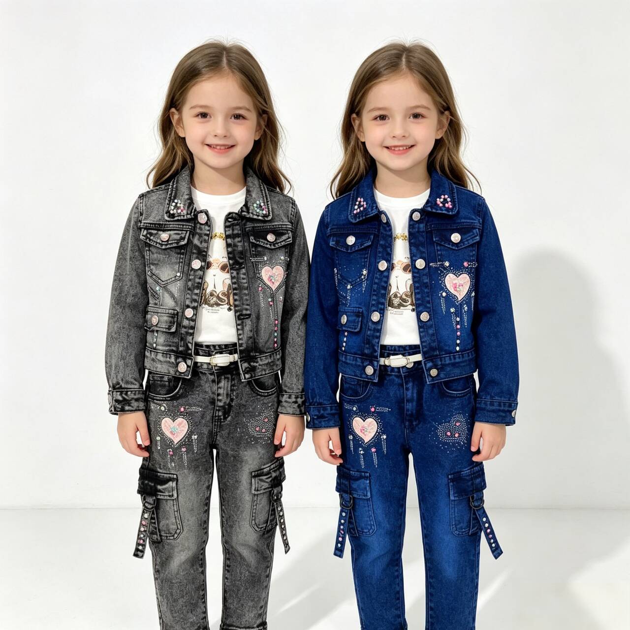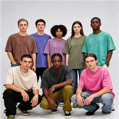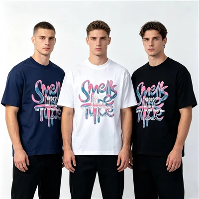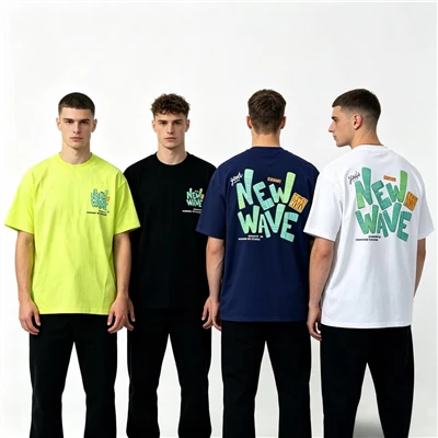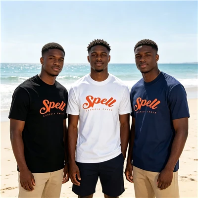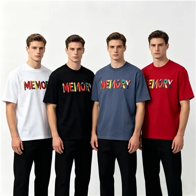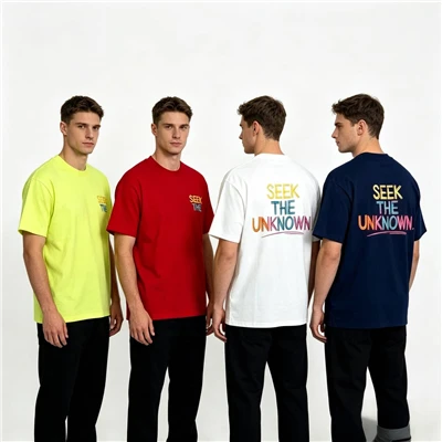
For a denim outfit, it is best to keep the colors consistent for a more cohesive look; mixing different colors-such as pairing gray with white-often does not yield the most flattering result.
There are several fundamental principles for color coordination:
1. Warm tones-primarily reds, oranges, and yellows-create an atmosphere that is cozy, genial, and vibrant.
2. Cool tones-such as cyans, greens, and purples-evoke a sense of tranquility, coolness, and elegance.
3. Contrasting tones-pairing colors with opposite characteristics, such as red and green, yellow and purple, or orange and blue-create a striking visual impact, resulting in a vivid and bright appearance.
When coordinating colors, follow the principle of "broad harmony with subtle contrast": the overall palette should remain unified and harmonious, while small-scale contrasts can be introduced in specific areas.
Conservative colors-such as blue, dark red, brown, and green-can be deepened or blended with gray to convey a traditional aesthetic.
Vibrant color combinations often feature yellow, a color that represents vitality and energy. When yellow is mixed with white, it creates a bright, luminous overall effect.
High-contrast color schemes-such as pairing yellow with its complementary color, purple-convey a sense of energy and action.
Elegant color combinations that utilize only the lightest, most muted tones-such as shades of beige-evoke a classic, sophisticated quality.
Classic color palettes often carry connotations of authority and power; royal blue serves as an excellent accent, standing out boldly without being overshadowed by other colors.
To express vitality, a color palette must include red-the quintessential color of "movement."
Navy blue is one of the most universally accepted colors; when paired with red and gold, it becomes less formal and more approachable.
Pink, a softer variation of red, is synonymous with romance.
Trendy color schemes-such as pale yellow-green-are visually pleasing while also possessing an eye-catching, impactful quality.
In high-pressure environments, gray-blue or light blue can foster a sense of peace and serenity.
Purple carries an air of mystery; when combined with orange or green, it creates a stimulating and novel effect. A deep, vivid red-orange-known as terracotta-can be used to create color palettes that are vibrant, warm, energetic, and earthy.
Earthy tones evoke a sense of a relaxed, comfortable lifestyle and are frequently employed to craft color combinations that feel welcoming and friendly.
Grays and blacks are often associated with a "professional" aesthetic, conveying a grounded and serious impression.
Achromatic designs rely exclusively on black, white, and gray; split-complementary designs pair a color with the hues located to either side of its direct complement; and monochromatic designs combine a single hue with its various tints and shades.
Complementary color schemes utilize colors that sit directly opposite each other on the color wheel, while neutral-based schemes incorporate the complement of a chosen color.